
Front-end Development
After design finalization
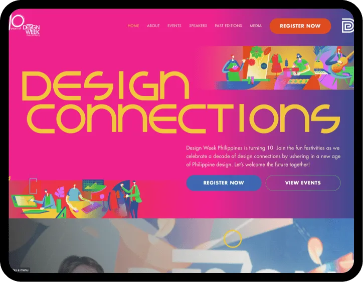
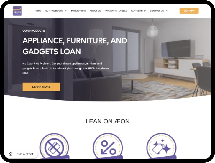
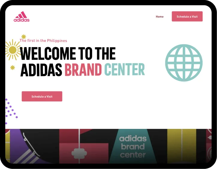
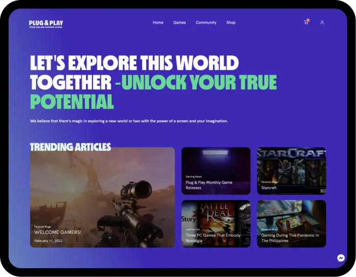
After the Website Interface Design stage, we proceed to the Website Front-End Development. This stage the proper conversion of design to code, and is essential to creating a website that is both beautiful and functional. Our Design Team works closely with our Website Front-end Development team to convert the designs from the Figma prototype to a working coded website that may now be viewable on multiple browsers.
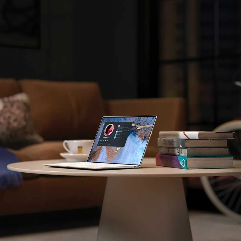
Responsiveness and optimization
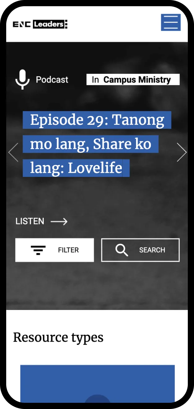
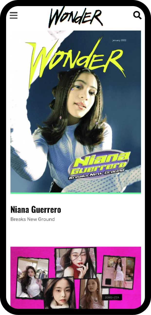
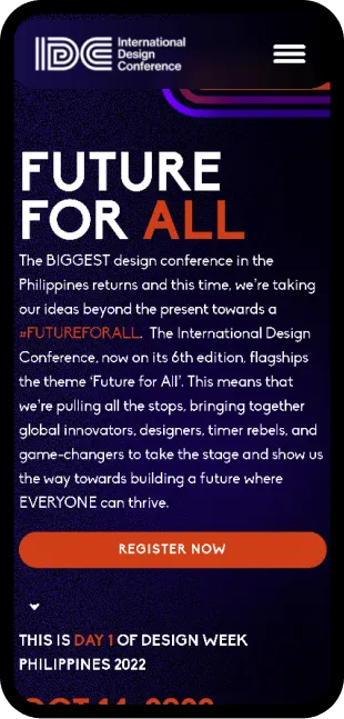
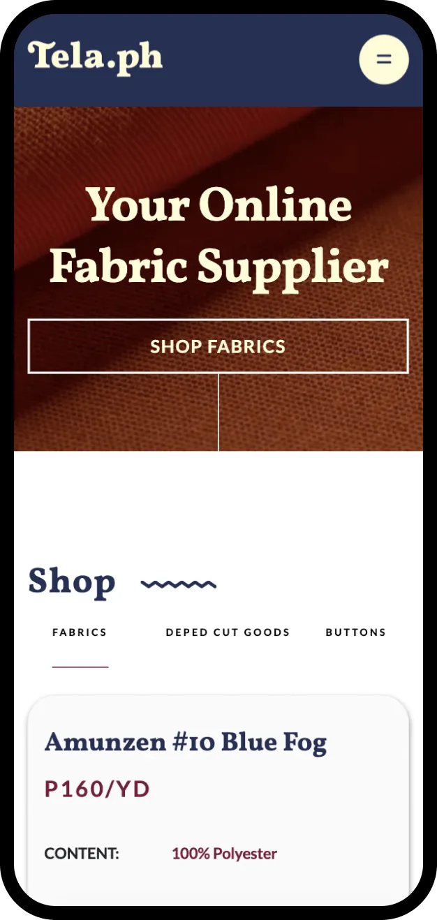
We understand that a website should be easy to navigate and view on any device. This is why we apply the website responsiveness protocols to ensure that your website looks great on any screen size. We also optimize the sizes of the elements and apply necessary transitions and animations to make sure that your website is optimized on multiple browsers, fast, and smooth.
Our team of highly skilled developers are dedicated to collaborating with you every step of the way. We take the time to understand your unique needs and goals to create a website that truly represents your brand and speaks to your target audience. We believe that open communication and a collaborative approach are key to creating a website that exceeds your expectations.
End user satisfaction
Dthree Digital is a trusted Manila-based Philippine web design and development company. With our expertise in Website Front-end Development, we can help you achieve a website that is both beautiful and functional. We strive to create a website that truly represents your brand and speaks to your target audience through excellent user-experience. Let's work together to achieve your business goals.
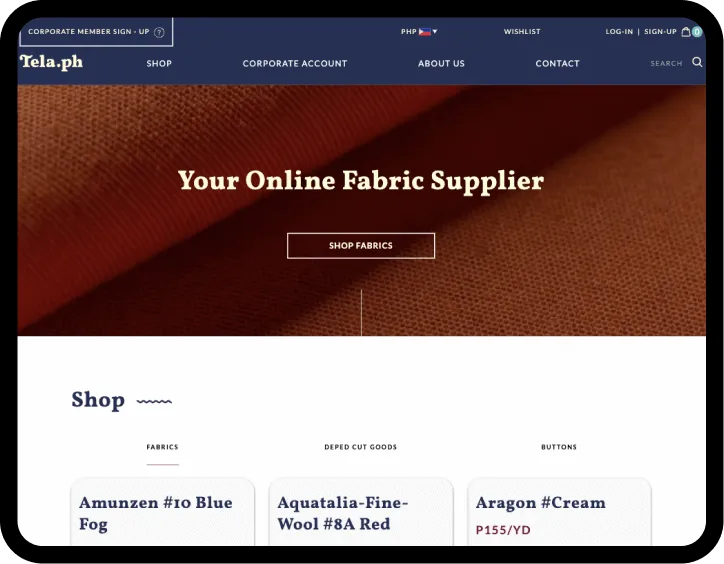
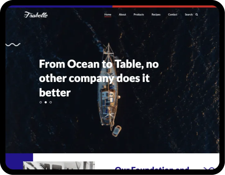
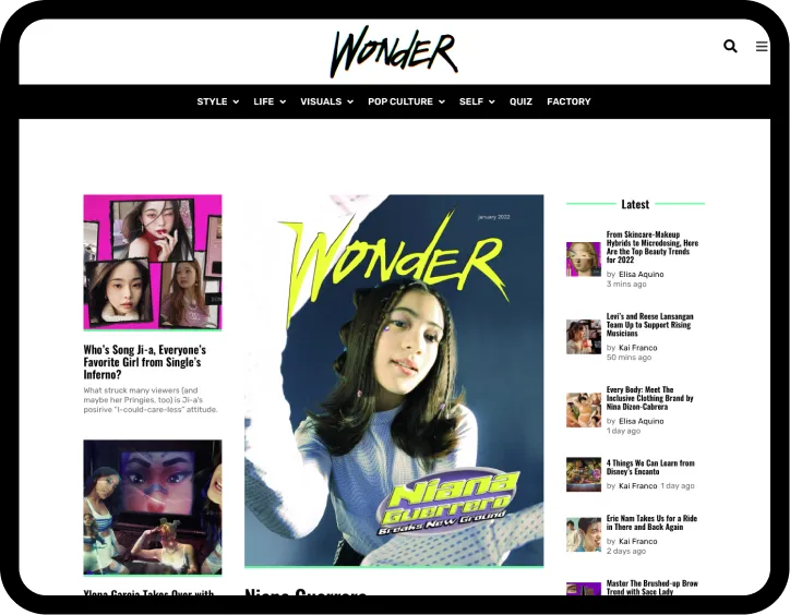
Projects with this Service

How does Dthree Digital ensure the responsiveness of the websites they develop?
Dthree Digital emphasizes a responsive design approach in our front-end development process. We use flexible layouts, images, and CSS media queries to ensure that the website automatically adjusts to the screen size and device it's being viewed on. This ensures a seamless browsing experience for all users, whether they're using a smartphone, tablet, or desktop computer.
What is Dthree Digital's approach towards mobile-first design in front-end development?
In today's mobile-dominant world, Dthree Digital prioritizes a mobile-first design. This means we start the design process from the smallest screen and then scale up. It allows us to ensure that the core content and functionality are delivered efficiently to mobile users, and the user experience is optimized across all devices.
How does the development team align with the design team at Dthree Digital?
Our development team works hand-in-hand with the design team throughout the project. We maintain constant communication to ensure a smooth transition from design to development. Regular meetings, collaborative tools, and iterative feedback processes ensure that the original design vision is faithfully translated into the final product.
How does Dthree Digital optimize front-end development for speed and SEO?
Dthree Digital follows best practices for speed optimization and SEO in front-end development. This includes minimizing HTTP requests, optimizing images, using CDN, enabling browser caching, minifying CSS, JavaScript, and HTML files, and eliminating render-blocking JavaScript. For SEO, we ensure clean and efficient code, use of meta tags, proper HTML tag hierarchy, and alt attributes for images, among others. This ensures a fast-loading, SEO-friendly website that ranks better in search engine results.
How does Dthree Digital ensure that the mobile-first design doesn't compromise the desktop experience?
While we prioritize a mobile-first design, we also ensure a high-quality experience on larger screens. We use responsive design techniques to progressively enhance the website for larger screens, adding features and layout changes that take advantage of the additional screen space. This ensures an optimized experience for users across all devices.


Read about other services


