
10 Signs Your Business Website Needs a Redesign
Websites rarely fail all at once. They fade while you are not looking, and the customers leave quietly. Here are the ten signs we look for when we audit a site, and what any three of them are costing you.

Hans Allí
10 Signs Your Business Website Needs a Redesign
The decline you do not notice
Your website is usually the first thing a customer meets before they meet you. When it is slow, dated, or hard to use, you lose business without ever seeing it happen. That is the trap. Websites rarely fail in one dramatic moment. They decline gradually. What looked current three years ago quietly starts to look old, the features that felt fresh in 2022 become the baseline everyone expects, and a competitor who reinvested in their site starts collecting the customers you assumed were still yours.
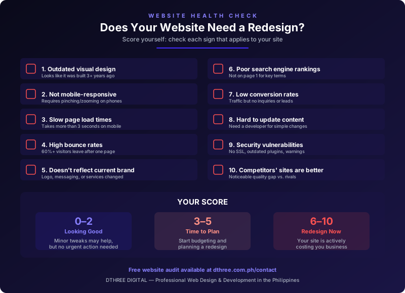
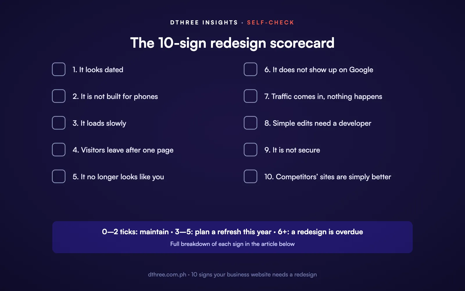
When we run a website audit, these are the ten signs we look for. Any three of them, and the site is already costing you more than a redesign would.
1. It looks dated
Design moves fast. Heavy gradients, tiny text, cluttered layouts, stock photos of people shaking hands: these read as "this business stopped paying attention," even when the business is excellent. First impressions do not wait for the fine print.
The fix is not paint. A real redesign brings in current fundamentals: generous white space, clean typography, professional photography, and a visual hierarchy that walks a visitor through the page instead of leaving them to fend for themselves.
2. It is not built for phones
Over 70% of web traffic in the Philippines comes from mobile. If your site makes people pinch, zoom, and scroll sideways, you are handing most of your visitors a frustrating experience. Google treats mobile-friendliness as a ranking factor too, so a site that fails on phones loses search visibility on top of goodwill. Mobile-first is no longer a preference. The site should be built for a thumb first, then scaled up.
3. It loads slowly
Speed is one of the least forgiving factors on the web. Research is consistent: 53% of mobile users abandon a site that takes longer than three seconds, and every extra second past that cuts conversions by roughly 7%. Test yours for free with Google PageSpeed Insights. A mobile score under 50 means you are losing visitors to load time alone, usually thanks to heavy images, plugin sprawl, aging code, or weak hosting.

4. Visitors leave after one page
A bounce rate above 60% means most people see a single page and go. Some bounce is normal. A consistently high rate means visitors are not finding what the search result promised them, and the usual causes are a misleading snippet, unclear messaging, slow loading, or a design that does not earn confidence. Open Google Analytics, find the pages bleeding the most, and make those your redesign priorities.
5. It no longer looks like you
Businesses change. If you have updated the logo, sharpened the message, added services, or shifted who you serve since the site was built, there is now a gap between who you are and what the site says. That gap confuses people and quietly erodes trust. Your website should reflect the business you run today, not the one you ran three years ago.
6. It does not show up on Google
If you are not on the first page for your key services and your location, you are invisible to the people actively searching for you. Poor rankings usually trace back to aging SEO practices, thin content, missing metadata, slow performance, and a weak mobile experience, all of which a proper redesign resolves. Done right, a redesign builds SEO in from day one: strong titles and descriptions, structured data, clean heading hierarchy, image alt text, and content aimed at the keywords that actually matter to you.
7. Traffic comes in, nothing happens
Traffic without conversion is wasted traffic. If people arrive but never fill in a form, ask a question, or take the step you want, the problem is almost always the experience: unclear calls to action, forms that are too long or too hidden, confusing navigation, no trust signals, or generic messaging. A conversion-focused redesign builds a clear path from landing to action, with deliberate CTAs, simpler forms, and content that persuades at each step.
8. Simple edits need a developer
If changing a line of text means emailing your developer, your CMS is working against you. A modern site should let your own team publish a post, update a bio, add a service, or swap an image without a support ticket. Platforms like Webflow and WordPress make everyday content management approachable, even for non-technical staff. If you dread updates, the platform is the problem.
9. It is not secure
An unsecured site puts you and your customers at risk. Watch for a missing SSL certificate (no padlock in the browser), an outdated CMS or plugins with known vulnerabilities, browser warnings when someone tries to visit, and spam or malicious content injected into your pages. Beyond the direct risk, Google actively demotes insecure sites. A redesign on a modern platform with automatic updates removes most of these exposures.
10. Your competitors' sites are simply better
Sometimes the clearest sign is the plainest. If the businesses you compete with have noticeably better websites, they are making a stronger first impression on the exact customers you are both chasing. Look honestly at your top three to five competitors. How do you compare on design, speed, content, and experience? If the gap is real, your site is quietly steering customers toward them, and closing that gap can hand the advantage back to you.
What to do if this sounds familiar
If three or more of these describe your site, a redesign belongs near the top of your list. The good news is that a well-planned one addresses all of them at once, provided it is approached strategically: clear goals first, decisions backed by data from your current site, and a team that understands both design and business results.
Do not think of a redesign as a cost. Think of it as removing the hidden costs your current site is already charging you, in lost leads, weaker brand perception, and missed search visibility. We have seen a redesign lift a client's lead generation when it was done for the right reasons.
Want an honest read on yours?
Dthree Digital runs complimentary website audits for Philippine businesses. We assess your site against every one of these ten signs and give you straight recommendations, not a sales pitch. Get in touch to book your free audit, or see how our consulting and auditing works.


.avif)